Review: The Emperor of All Maladies

The Emperor of All Maladies
The Emperor of All Maladies by Siddhartha Mukherjee
My rating: 5 of 5 stars

By chronicling the efforts of individuals and organisations to defeat and understand cancer, the book to me is a mirror of our biological and psychological natures: compelling and unsettling at the same time.

The author (with very good editors I assume) weave a narrative of social trends, medical orthodoxies and human bias through the decades. It begins with the search for cures and progresses to efforts to discover how cancer actually begins and propagates, touching on other topics and fields in the process such as statistics, palliative care, legal struggles against tobacco companies. The author also scatters excerpts from his own personal experiences with cancer patients where appropriate.

It’s a work that captures human failings and accomplishments in a historical and social context. The author explains that he wanted to call it a “biography” because it felt as if he were writing about a specific person. I’d like to build on that – “The Emperor of All Maladies” is more like a mosaic comprising the efforts, sufferings and triumphs of countless people in an ongoing struggle against an implacable and intimate enemy.
View all my reviews

Platinum ReCelluloid “Cha-ringu”(チャリング)

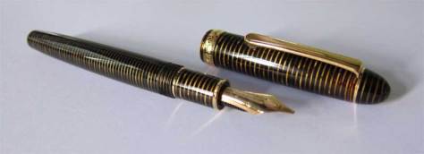
A discontinued pen from Platinum’s ReCelluloid range of, well, celluloid pens.

From online searches, this pen was seems to date from the mid-1980s to mid-1990s. Lambrou’s “Fountain Pens of the World” lists similar pens (going by nib design) from around 1992.

The celluloid used resembles the striated celluloids used for the Parker Vacumatic:

It even has semi-transparent strips alternating with opaque, slightly pearlescent ones:

Platinum makes the ReCelluloid pens by rolling thin celluloid sheets, rather than by turning celluloid rods on lathes. The former saves money and manpower, but the pen ends up with a distinct line where the edges of the sheet meet.

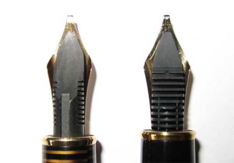
This pen has a different feed (left) from current production pens (right). Could it be ebonite?

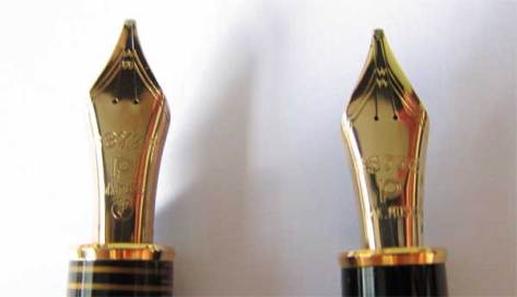
Its music nib (left) seems a touch springier and smoother than the one on a more recent Platinum #3776 Balance (right):

Writes very nicely with Sailor’s Waka Uguisu ink. According to the seller, this one was a dry writer. If you’ve a Platinum pen and have similar thoughts, you might want to try a Sailor ink before adjusting the nib.

On a side note: on page 115 of Nakazono’s “Fountain Pens of the World” (not to be confused with Lambrou’s far more comprehensive work), there’s a circa 1931 Dunhill-Namiki plunger-filler with an almost-identical shape and similar-looking celluloid with silver instead of brown rings. An inspiration for Platinum’s pen designers?

TWSBI 530 + Pelikan 14C nib

I’m enjoying writing with the TWSBI 530 a lot more after installing a Pelikan nib on it (likely from a M250), though with the clear faceted barrel I can’t shake entirely the feeling that I’m writing with a Ferrero Rocher box. Switching nibs was easy. The TWSBI nib and feed are friction-fit and can be pulled out. Here’s a demo on YouTube:

On a side note – the original EF nib on the TWSBI wrote a very fat line closer to a Fine-Medium, with a little feedback.

EDIT: I originally thought the nib was from a Pelikan 140.