Saga, Volume 1 by Brian K. Vaughan
My rating: 4 of 5 stars
Review: A Fighting Chance

A Fighting Chance by Elizabeth Warren
My rating: 4 of 5 stars
In lieu of a review, I’d like to share 2 quotes that I especially liked —
“Sure, government fails sometimes. (By the way, corporations fail sometimes, too.) But I don’t believe the response to government failure — such as the inept response to Hurricane Katrina or the slew of failures that led to the financial crisis — should be a snarky “I told you so” or a heavy sigh of resignation. No: the response should be *outrage*. The government — *our* government — should be held to a higher standard.” (p.186)
“How do we build a future? I made the case for what I believe: We are stronger and wealthier because of the things we build together. We are more secure when we create a foundation that allows each of us to have a decent chance to build something on our own. We are better off when we invest in one another. It’s economics and values, tied tightly together.” (p.216)
Every time I’m tempted to buy a lever-filler….
Review: Ministry of Moral Panic

Ministry of Moral Panic by Amanda Lee Koe
My rating: 4 of 5 stars
The stories impress themselves upon you, and you’ll remember each one’s unique shape, tone and character. Raw in some areas, jarring in others (an uneducated housewife with a penchant for Tsai Ming Liang?), teetering on cliche even. But Lee Koe shows she has her finger clearly on the pulse of these times: our sex-cynical, social media-soaked, hipster-populated years. She’s only 23 @_@ I’m looking forward to more of her writing.
Review: The Lost Carving: A Journey to the Heart of Making
Pilot Scholar E
The Scholar E is a marvel for Pilot fans. It combines features from a few Pilot Japanese models and then some.
The pen has the torpedo size and shape of the Custom 74 (and the Custom 67 before it) but with a different cap band and – most notably – guilloche-like chasing on the black plastic.
Under the cap, the pen sports a large inlaid nib – a distinctive design that debuted on the Pilot Elite series of pens, and is available these days only in 18K gold on expensive offerings like the Silvern series or last year’s Elite 95 reissue. This is a steel nib though, just gold-plated.
The squeeze-filler on the pen is unique too. It looks like a larger CON-20 (Pilot’s current production squeeze converter) and it screws into the section housing. The filler is easily unscrewed but the section lacks a piercer for cartridges. The sac is clear plastic – probably vinyl.
The Scholar E was (is?) made in Korea, apparently by a licensee of Pilot that is still in business according to Bruno Taut. The pen can’t be imported into Japan it seems.
Maybe I’ve been spoilt by other pens, but I paid about US$50 for this Pilot Scholar E and I think the weight and materials are just about OK for this price point. Cosmetically, the cap and barrel are a different material and shade of black from the captop and barrel end. The chasing is interesting but cut shallowly. The gold-plating on the nib has flaws too. The plastic for barrel and cap feels a bit too light. The ends unscrew easily as well.
The nib is stiff as a nail. Not scratchy but also not as smooth as a Japan-made steel Pilot nib e.g. on the Prera. And on my pen ink seeps out from the back of the nib. No serious leaking or blobbing, but I do need to be careful not to put my fingers there when I write.
In all, a budget-priced curiosity or treat for Pilot fans.
Capped length: 14.4 cm
Uncapped length: 13.6 cm
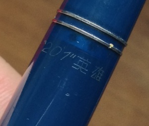
201 Hero (“201” 英雄), 1955(?) -1966
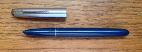
This is a well-used 201 Hero ( “201” 英雄 ) from the Shanghai Huafu ( 华孚 ) fountain pen factory. The pen is the nicest copy of the Parker “51” I’ve handled so far. Parts fit well. Doesn’t feel too light or flimsy. Has a gold nib and what looks like a celluloid jewel on top of the cap.
There’re 2 interesting modifications to the “51” design: the faux “clutch ring” comprising a piece of plastic sandwiched between 2 thin metal rings, and a thin metal band with circular cutouts on the inside rim of the barrel (probably to prevent cracking but visually interesting too).
Capped length: 12.6 cm
Uncapped length: 13.7 cm
This pen was very well-used and clearly much-loved. Ink flow is a bit dry and I think the feed could be fitted more closely to the nib. But the nib writes so smoothly regardless. (Worn down with regular use?)
I’ve more questions about this pen. Why was there so much blue ink inside? Why was it left to dry out when it was clearly well-used and so worn? How many people have owned it? How did it leave China in the first place? Where did it spend the decades?
Have been trying to pin down production dates. Based on this source and others it seems the pen was made sometime between 1955 and 1966. 1955 was when the Shanghai Huafu Fountain Pen Factory (华孚金笔厂) launched its “Hero” brand of fountain pens. 1966 was when the factory changed its name to “Hero Fountain Pen Factory” (英雄金笔厂) (possibly due to events during the Cultural Revolution?).
If you’ve more information about this pen, please feel free to post comments. Would love to hear from you 🙂
Review: The Spectre of Alexander Wolf

The Spectre of Alexander Wolf by Gaito Gazdanov
My rating: 3 of 5 stars
Liked the descriptions and scenes of 1920s (I think) Paris the most. These are narrated tersely, with just enough visual and aural detail. Thought the narrator’s inner ruminations seemed convoluted and tedious by comparison, with the diction overly formal.
Kaweco Dia2, 2013
Classic styling with lots of thoughtful little details.
Kaweco was no more by 1976, but the brand was revived in the mid-1990s by the Gutberlet family, who runs a firm specialising in industrial equipment for pen manufacture.
In terms of design, Kaweco’s lineup is heavily influenced by Kaweco pens of the 30’s. The Dia2 is an excellent example.
Design and Materials
I like the combination of pre-war German styling with modern elements. The Dia2 is ultimately inspired by a Kaweco Dia c.1940 (see this FPB thread for some pics — http://fountainpenboard.com/forum/index.php?/topic/67-what-is-this-kaweco-i-found/). Modern elements include: the barrel design (more on that below); logo inserts on crown and barrel end and the engraved script on the back of the cap. The knurling and gold trim at the barrel end evoke a piston-filler’s turning knob.
As the name implies, the Dia2 is the latest version of Kaweco’s earlier re-issue of the Dia. That pen followed the vintage Dia design much more closely. You can see pics here — http://thefountainpens.com/kaweco-dia/
The Dia2 has a less monolithic profile and a more slender barrel, designed such that it bulges a little in the middle before tapering towards the end (c.f. Pelikan’s Wonders of Nature models). The section is also simpler, and slightly concave.
Cap and barrel are plastic, but the pen has a bit of heft due to the metal parts. The inner cap is a metal piece, the clip brass. The inner barrel threads look like brass as well, though that piece doesn’t extend the length of the barrel. Pens like these don’t feel as cold as, say, Waterman’s usual lacquered/painted all-metal barrels.
Nib
The Dia2 comes equipped with a steel nib plated to match the trim. The nib is sized for the Kaweco Sport, a much smaller pen, and the units are interchangeable. I suppose this helps keeps costs down but the nib is visually too small relative to the rest of the pen.
Performance-wise, no problems. Smooth out of the box (which, btw, was a very attractive vintage-inspired tin 🙂 )
Filling System
Cartridge/converter, and Kaweco converters come printed with their logo — a nice touch. If you use international short cartridges, you’d probably appreciate the loose spring inside the barrel which allows you to keep a spare international short cartridge inside without having it slide up and down.
Length (capped): 13.3cm
Length (uncapped): 12.2cm
Majestic flat-top, pearl and black
Found another charming Majestic — one I’ve never seen before. Looks just like a Waterman 52 especially with the riveted clip. Comes with a Warranted 14K “2” nib. I still half-expect to find a number stamped on the barrel end. It’s probably older than the Majestic I posted earlier.
Incidentally, Jon Veley has pics of Majestic pencils in similar pearl and black celluloid, with riveted clips on his site.


